 12-12-2005, 03:50 PM
|
#71 | ||

    Join Date: Oct 2004
Location: Wimbledon, England
Posts: 1,624
|
The last is best but I advise you use on colour palete.
Try making the entire image a greyscale piece and then add a colour balance layer.
__________________
|
||


|
|
|
13-12-2005, 02:57 PM
|
#72 | ||
  Join Date: Aug 2004
Location: Shella, Kenya
Posts: 968
|
The third is my personal fav, but the other versions are both quite cool!
Do those symbols have a meaning as they're in the piece, or just randomly placed? And do you mind if I correct your topic's title ( that would be "Quintopotere Does It Better" :whistle: )? |
||
|
|
|
|
13-12-2005, 04:48 PM
|
#73 | |||

 Join Date: Apr 2005
Location: Turin, Italy
Posts: 1,043
|
Quote:
Well, I use to put everything that I want of the same colour in a grey scale layer and after I use the "colour layer" tool of GIMP: is this what you want to say me? Quote:
Quote:
I noticed the error just now 
__________________

|
|||
|
|
|
|
17-12-2005, 12:25 PM
|
#74 | ||
|
Join Date: Apr 2005
Location: Turin, Italy
Posts: 1,043
|
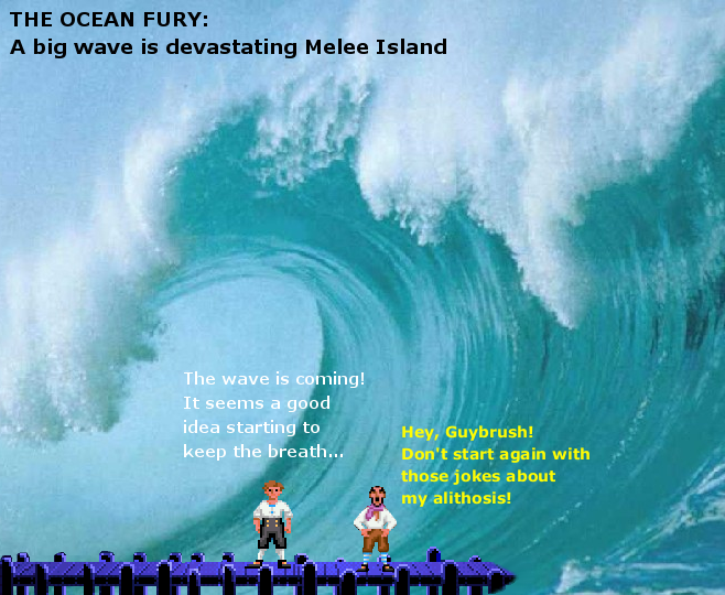
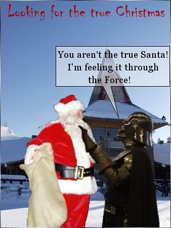
I update the topic with the pics i made for the "pic of the month" and the "Christams pic" contests: enjoy!
__________________
|
||
|
|
|
|
27-12-2005, 06:34 PM
|
#75 | ||
|
Join Date: Apr 2005
Location: Turin, Italy
Posts: 1,043
|
Uuhhh... I'm forced to triple post, cause I had no replies to the previous ones...
Well, I'm making a digital version of the simbol of my martial art school: do you like it? 
__________________
|
||
|
|
|
|
28-12-2005, 08:17 PM
|
#76 | ||
|
Join Date: Oct 2004
Location: Wimbledon, England
Posts: 1,624
|
I do.
Stylish and Logo-Like. However, the shadow ring looks much larger than the 'floating' pyramid. It knocks the perspective of and makes the pyramid look misalligned. Show us it when it's finished!
__________________
|
||
|
|
|
|
01-01-2006, 06:24 PM
|
#77 | ||
|
Join Date: Apr 2005
Location: Turin, Italy
Posts: 1,043
|
Actually I had some problems in giving a perspective to the pic... maybe I'll try to make smaller the bottom ring, as you said... but my master liked it and so, I'm not sure that I'm going to modify it...
Thanks for the suggestion  k: k:
__________________
|
||
|
|
|
|
01-01-2006, 06:52 PM
|
#78 | ||
|
Join Date: Oct 2004
Location: Wimbledon, England
Posts: 1,624
|
Thats sad news

__________________
|
||
|
|
|
|
19-01-2006, 07:01 PM
|
#79 | ||
|
Join Date: Apr 2005
Location: Turin, Italy
Posts: 1,043
|
I'm quite busy in theseday so I've not updated this thread for too many days...
Well... I'm working (even) on the graphic presentation of the thesis for my degree and I'd like to make something more original than the usual PowerPoint presentation... This is the best i made at the moment:  Do you like it? If someone has suggestions or critics... they could be helpful 
__________________
|
||
|
|
|
|
27-01-2006, 09:24 AM
|
#80 | ||
|
Join Date: Apr 2005
Location: Turin, Italy
Posts: 1,043
|
This is the (out of competition) pic I made for the January competition (about what we see in the future), enjoy
k:
__________________
|
||
|
|
|


 Linear Mode

